NBA Paths to the Playoffs
Beneath is my personal project work to create a visualization that charts the progression of an NBA team's season. Each graph charts the win-loss path of a team and uses the background to provide a comparison to past seasons as well as historical playoff probabilities. The graphs below therefore represent a mixture of both historical and current NBA season data. The major components are the background, the highlighted paths and the color gradients.
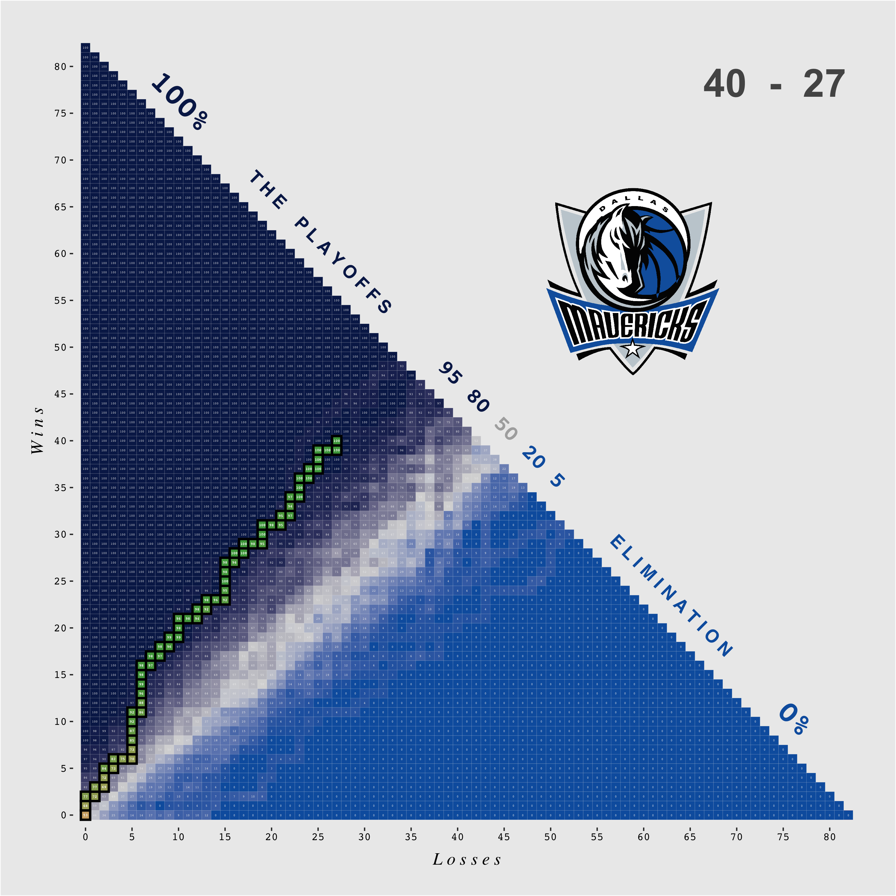
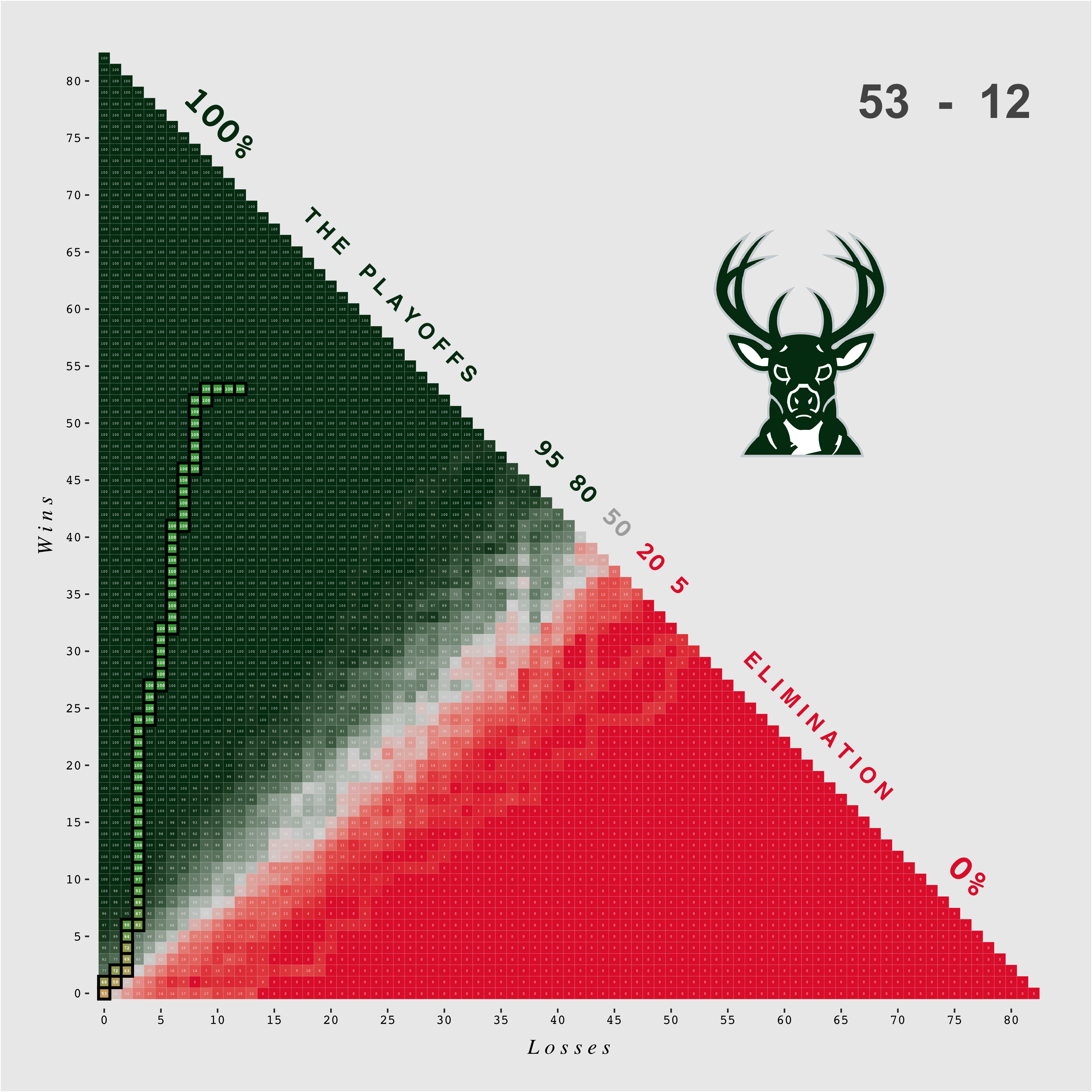
Background: The underlying values of the backdrop come from a matrix of the historical probability that an NBA team made the playoffs, given that the team had y wins and x losses. Each number inside each box indicates this exact probability. The data were collected from basketball-reference.com for the 1978/79 season (the year of the NBA/ABA merger) through the current season.
Paths: As a layer on top of these historical probabilities, there is a highlighted path which shows the current progress of a team moving through the 82 game season. At a glance, teams that rise to the top left quadrant have true championship hopes, whereas teams stuck in the bottom right are simply waiting for the next LeBron.
Color Gradients: Every background color gradient comes from the corresponding team's colors. The top left color represents a 100% historical probability of making the playoffs given the team's record, the middle color represents a 50% historical probability and the bottom right color represents a 0% historical probability. Every path color gradient uses the same historical probabilities as its base values and uses the simple green = 100%, yellow = 50%, red = 0% spectrum, while shading the in-between values appropriately.